

Shane Oliver
Key points
- The War with Iran has led to a surge in oil prices & worries of stagflation which has pushed share markets sharply lower.
- Predicting how this will all unfold is hard. The key is to stay focussed on the basic principles of successful investing.
- These five charts focus on principles of investing critical in times like now: the power of compound interest; don’t get blown off by the cycle; the roller coaster of investor emotion; the wall of worry; and market timing is hard.
Introduction
Most of the time share markets are relatively calm, but periodically they tumble and generate headlines like “billions wiped off share market.” Sometimes it ends quickly and the market heads back up again. But every so often share markets keep falling for a while. Sometimes the falls are foreseeable (usually after a run of strong gains), but rarely are they forecastable (which requires a call as to timing and magnitude). And now with the US and Israel waging War on Iran its happening again with falls gathering pace as the War drags on. From their record highs earlier this year 7%, Japanese shares have fallen 12%, Eurozone shares are down 11% and Australian shares are down 9%. While the details regarding the current plunge differ from past falls, from the point of view of basic investment principles, it’s hard to say anything new. Which is why this note may sound familiar with “5 key charts for investors to keep in mind”.
The current state of the War and flow on to markets
We are now into the fourth week of the War with no clear sign of an end – despite President Trump’s frequent reassurances that the end is near.
- A problem is Trump indicated regime change was a goal – along with a group of military objectives – and killing of Iran’s leaders and musing about replicating the Venezuelan model appear to confirm this.
- So, Iran took the long-predicted response of attacking regional oil and gas infrastructure and effectively closing the Strait of Hormuz.
- Which in turn has potentially created the biggest oil & energy shock in history given 20% of world oil and gas flows through the Strait.
- This in turn has led to a surge in oil and gas prices which in turn has seen bond yields rise on inflation fears, the expected profile for official central bank interest rates rise sharply and shares fall on fears of higher inflation and rates and weaker growth and profits.
- By declaring that the War would be over “very soon” on 9 March and that he was considering “winding down” the War on 20 March, both after sharp oil price rises, Trump has signalled he can’t bear the full economic and political costs of the War. So just like his tariff TACO back down, many assume he will do the same this time which is why the rise in oil prices and fall in shares has so far been relatively mild.
- But the Iranian leadership shows no sign of waving a white flag and in fighting for survival wants to inflict maximum economic and political pain on Trump – which they know they can do by restricting oil supplies. So this makes it harder to him to do a TACO.
- There are various workarounds to the Strait blockage – Saudia Arabia’s pipeline to the Red Sea, stockpile releases, US naval escorts, Iran letting non-enemy ships through, etc – but its unclear they are enough or will work. Eg the US doesn’t have the capacity to defend every tanker. If Iran lets too many ships pass it weakens its leverage. And the US may not like the idea of Iran deciding who goes through.
- Right now, despite lots of confusing comments from Trump the risk is more escalation – with a consideration of using troops and now threatening to obliterate Iran’s power plants. Iran is threatening more retaliation against energy infrastructure in response.
- Past oil price shocks unfolded over months as the impact became clearer – 4 months in 1973 when oil prices rose four-fold & more than a year in 1979-80 when oil prices rose three-fold. It’s still early days.
- So, the threat of stagflation remains and it’s at a time of various other threats to shares around AI, private credit & stretched valuations.
- Current average capital city petrol prices in Australia of around $2.45 will if sustained add 1.5% to inflation taking it above 5% and add $114 a month to the household petrol bill which along with increasing risks of fuel shortages will lead to a big hit to economic activity.
Our base case is that the War and oil shock will be relatively short as Iran will not be able to keep the Strait closed indefinitely and Trump will look for an off ramp as political pressure builds ahead of the midterms. But it could still go on for weeks yet and so could still see oil prices rise more in the interim say to $US150. We continue to see the risk of a 15% or so correction in shares this year but the size of the threat means there is a high risk it may be deeper. Trying to work out how all this plays out is not easy. But looking at shares around major geopolitical events, the typical playout is for a sharp fall of around 8% but then a recovery over the next 12 months of around 14%. Of course, there are wide ranges around this. Given the uncertainty now is a critical time to stick to basic principles of investing. So, this note revisits 5 key charts investors should keep in mind.
Chart #1 The power of compound interest
This chart shows the value of $1 invested in various Australian assets in 1900 allowing for the reinvestment of dividends & interest along the way.
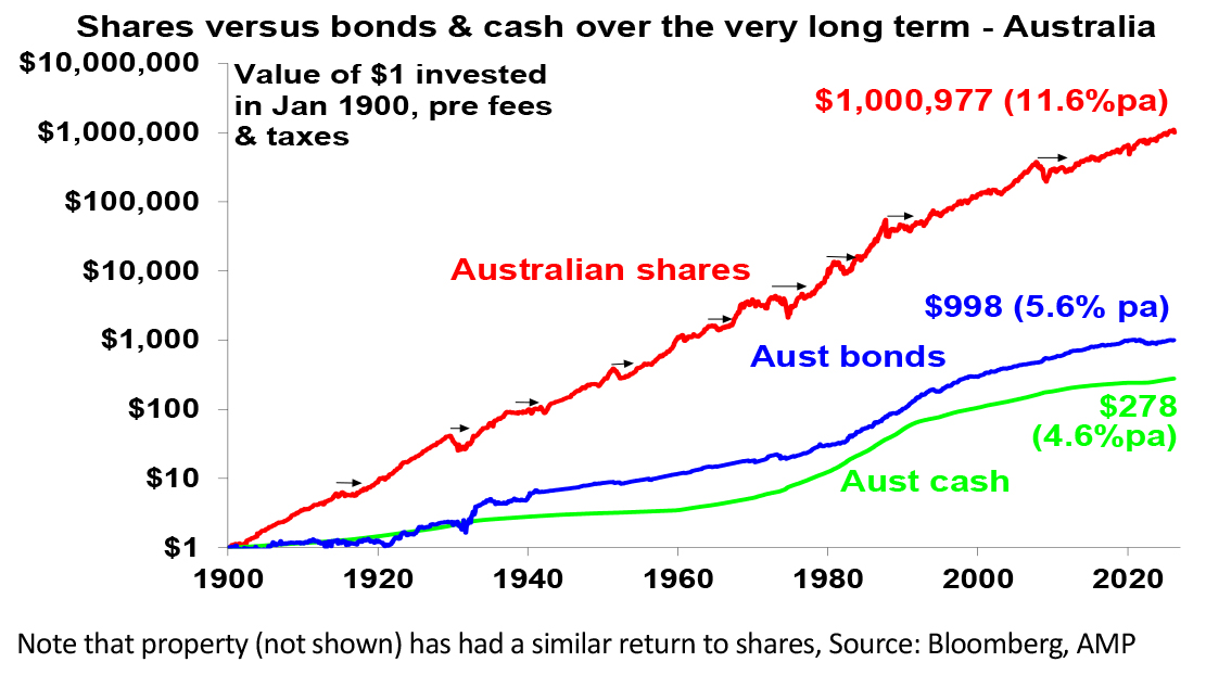

That $1 would have grown to $278 if invested in cash, to $998 if invested in bonds and to $1,000,977 if invested in shares up till now. While the average return since 1900 is only double that on shares versus bond, the huge difference between shares and bonds owes to the impact of compounding – or earning returns on top of returns over time. So, any return earned in one period is added to the original investment so that it all earns a return in the next period. And so on. Which means higher average returns over time compound into much higher end point values.
Key message: to grow wealth, we must have exposure to growth assets like shares and property that provide higher long term average returns.
Chart #2 Don’t get blown off by cyclical swings
The trouble is that shares can have lots of setbacks, eg, see the arrows on the previous chart. Even annual returns are highly volatile, but longer-term returns tend to be solid and relatively smooth. Since 1900, for Australian shares roughly two years out of ten have had negative returns but there are no negative returns over rolling 20-year periods.
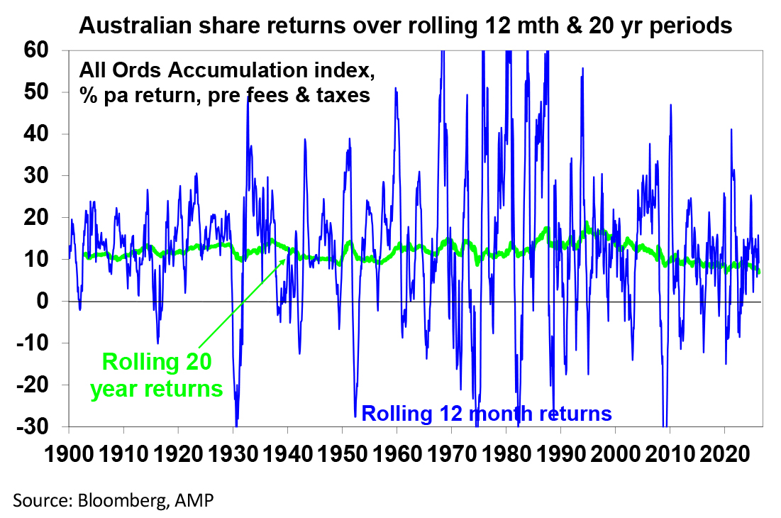

Understanding that these periodic setbacks are just an inevitable part of investing is important in being able to stay the course.
Key message: big short-term swings in shares are normal but the longer the horizon, the greater the chance your investments meet their goals.
Chart #3 The rollercoaster of investor emotion
Investment markets move more than can be justified by moves in their fundamentals, because investor emotion plays a huge part. The next chart shows the roller coaster that investor emotion traces through the course of an investment cycle. Once a cyclical bull market turns into a bear market, euphoria gives way to ultimately depression at which point the asset class is under loved and undervalued and everyone who is going to sell has – and it becomes vulnerable to good (or less bad) news. This is the point of maximum opportunity for investors to buy into an asset at depressed prices. Once the cycle turns up again, depression gives way to hope and eventually euphoria. This is the point of maximum risk.
The roller coaster of investor emotion
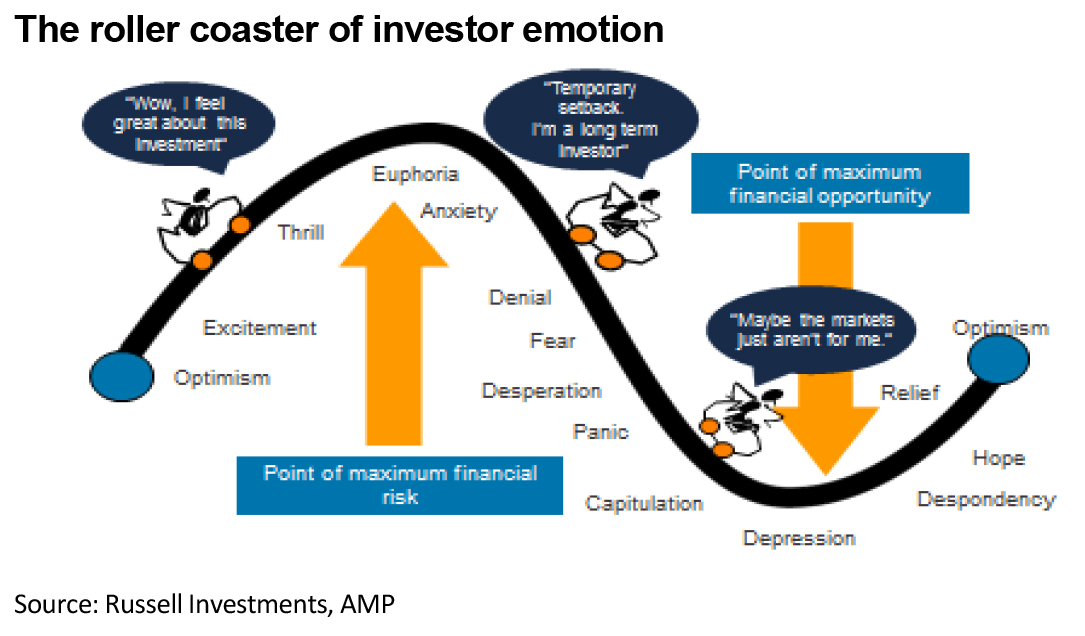

Key message: investor emotion plays a huge role in driving swings in markets. The key for investors is not to get sucked into this emotional roller coaster. Of course, this is easier said than done, so many investors end up getting wrong footed – by buying at the top when everyone is bullish and selling at the bottom when everyone is bearish (like in April last year on US tariffs, or maybe soon on worries about the oil supplies).
Chart #4 The wall of worry
There is always something for investors to worry about. And this has certainly been the case since Trump returned with his contradictory and confusing utterances. But the global economy has had plenty of worries, but it got over them with Australian shares returning 11.6% per annum since 1900, in a broad rising trend, and US shares returning 10% pa.
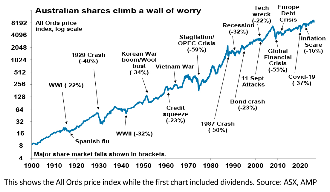

Key message: worries are normal around the economy and investments and sometimes they become intense – like now. But they eventually pass.
Chart #5 Timing markets is hard
With the benefit of hindsight many swings in markets around things like the GFC and the 2022 inflation surge look inevitable and so it’s natural to think about switching between say cash and shares within your super fund to anticipate market moves. But trying to time the market is difficult. A good way to demonstrate this is with a comparison of returns if an investor is fully invested in shares versus missing out on the best (or worst) days. The next chart shows that if you were fully invested in Australian shares from January 1995, you would have returned 9.4% pa.
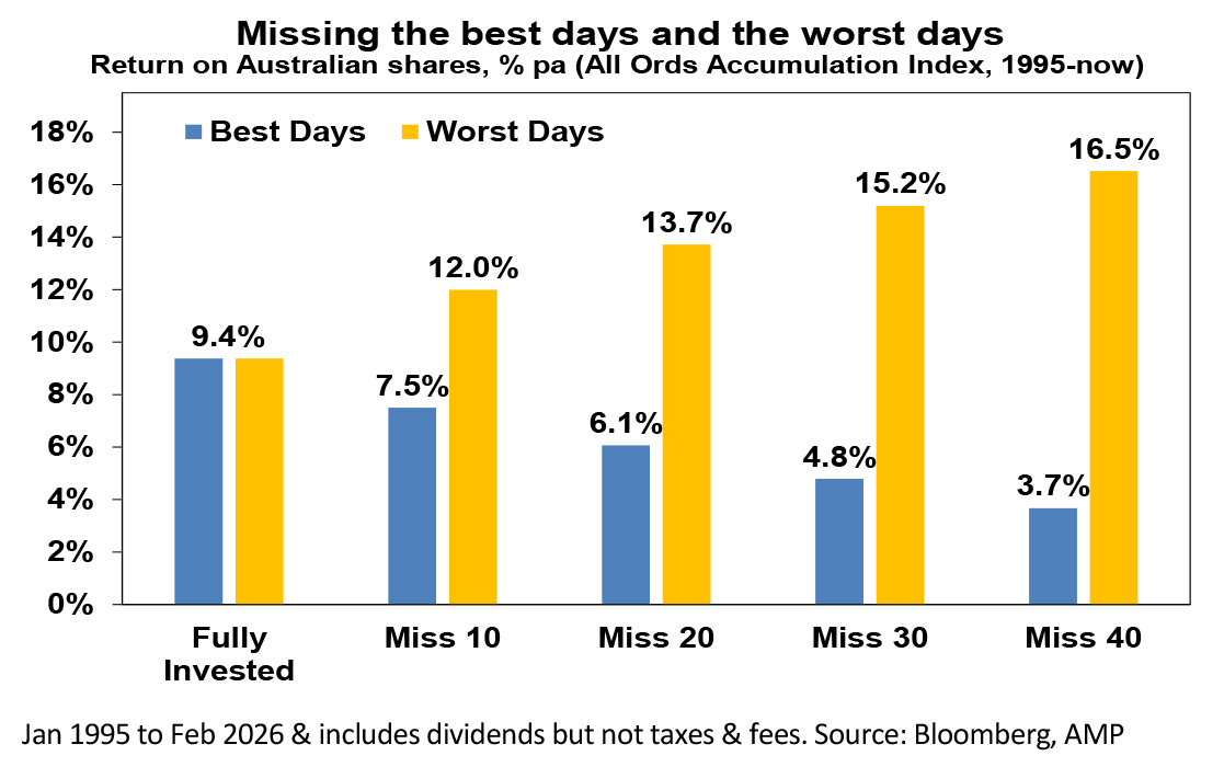

If by trying to time the market you avoided the 10 worst days (yellow bars), you would have boosted your return to 12% pa. And if you avoided the 40 worst days, it would have been 16.5% pa! But many investors only get out after bad days & miss some of the best days. If by trying to time things you miss the 40 best days (blue bars), the return falls to 3.7% pa.
Key message: trying to time the share market is not easy. For most – whether as a super fund member or as an investor outside super – its best to stick to an appropriate well thought out long term investment strategy.
By Dr Shane Oliver, Head of Investment Strategy and Chief Economist, AMP