
Nine key charts for investors to keep an eye on amidst oil and AI worries

Shane Oliver
Key points
- The first half of this year saw good share market returns despite the oil supply shock on the back of the US/Iran War.
- We remain upbeat on a 12-month view but see a high risk of another correction in the short term.
- Nine key charts worth watching are: business conditions PMIs; inflation; inflation expectations; ship traffic through the straits of Hormuz and Bab el-Mandeb; global oil reserves; oil prices; profit growth; Korean shares and the AI boom; and bond yields and share market valuations. They are sending cautious signals.
Introduction
Share markets had a strong first half despite the oil supply shock as expectations for de-escalation, okay economic data, strong profits and the AI boom provided an offset. This note looks at nine key charts worth watching going forward, particularly with the Iran War escalating again and concerns about the sustainability of the AI boom.
Chart 1: Global business conditions PMIs – okay
With the War escalating again with strikes from both sides back to including energy infrastructure and oil on the way back up the risk of recession globally and in Australia is now rising again. The historical experience indicates that if recession is avoided any fall in shares will be relatively short term in nature. Business conditions PMIs – surveys of business conditions globally – will provide a key early warning. At present they are okay.
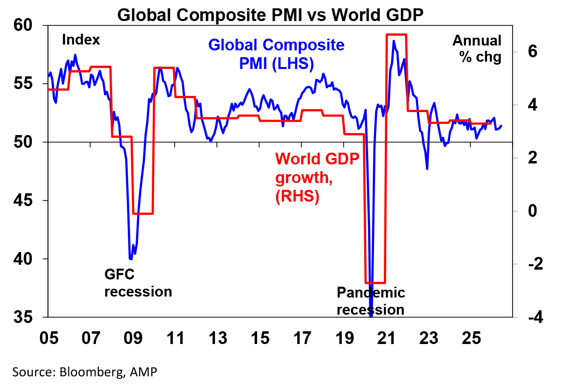
Chart 2: Inflation (and hence interest rates) – negative
While underlying inflation is around target in Europe and Canada, in the US, UK and particularly Australia its well above target. The fall in oil prices had taken some pressure but now it’s on the rise again threatening a flow on to underlying inflation and inflation expectations at a time when many US Fed officials are losing patience with inflation and the RBA still retains a tightening bias. The rebound in oil prices threatens higher interest rates, which would be a drag on shares. So underlying inflation is key to watch.
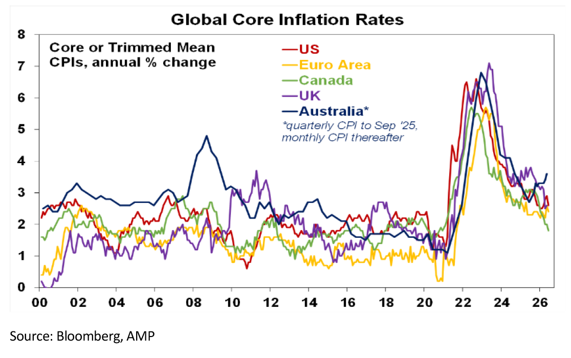
Chart 3: Inflation expectations – slight negative
The oil shock on the back of the 2022 inflation surge, US tariff hikes and cost of living pressures runs the risk that inflation expectations move higher making it harder to get inflation down. So far there has only been a mild rise in the US and Australia, but a further rise would justify more rate hikes.
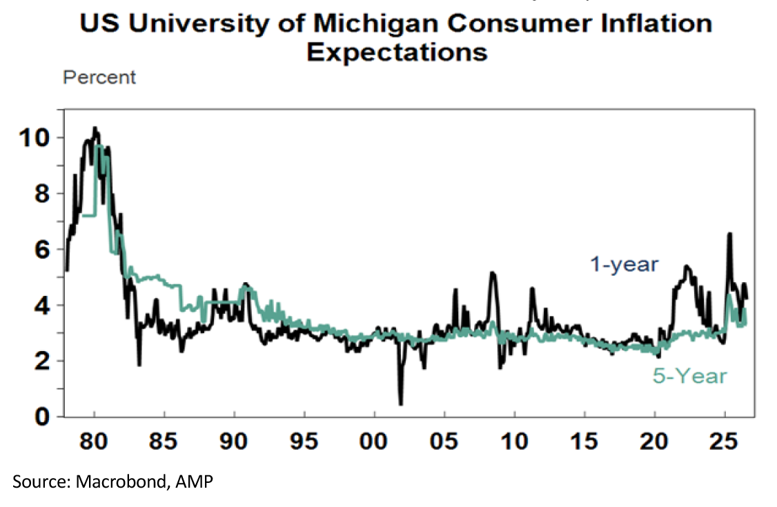
Chart 4: Shipping through Hormuz & Bab el-Mandeb
The Strait of Hormuz is effectively closed again. This would normally see 20% of global oil supply, or 20 million barrels, flow through every day. With diversions – using the Saudi East-West pipeline to the Red Sea and the UAE’s pipeline to Fujairah – the hit to supply is around 12-13 mbd. So far the world has seen little impact as it’s been running down reserves but this has a limit and the more Iran is pressured the greater the risk it attacks Fujairah and/or its proxy Houthi Rebels will block the Bab el-Mandeb Strait, the southern exit from the Red Sea – both of which would disrupt the Hormuz bypasses and speed up the rundown of oil reserves. So shipping through these two straits remains key to watch.
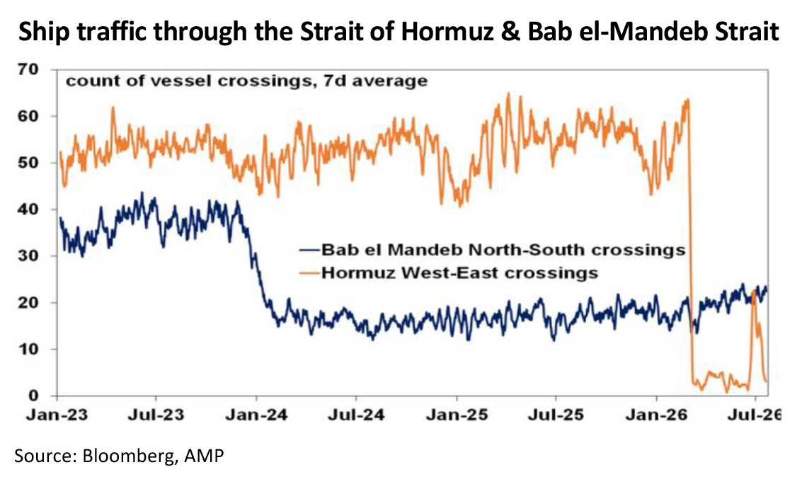
Chart 5: Global oil reserves – slight negative
So far, the rundown in oil reserves looks modest based on IEA data. But this likely understates the fall given uncertainty about Chinese reserves.
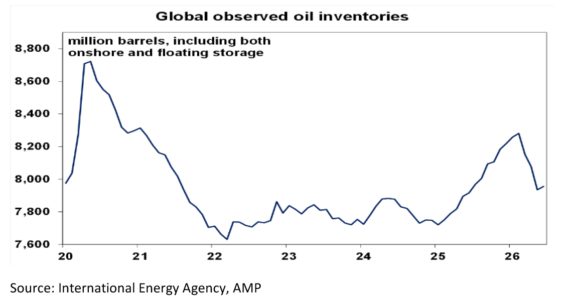
Chart 6: Oil prices – negative
So, the longer the oil production hit continues the more oil prices will rise. Rough estimates suggest that to offset a 12% hit to global production will ultimately require an oil price of around $US150 a barrel. This would risk much higher inflation and rate hikes and possibly recession. So far, we are well below that at around $US90 for Brent. There are no easy solutions for Trump now – ensuring Iran does not have an ability to block Hormuz or develop nuclear weapons will come at a cost Trump is not prepared to take (including US lives lost and another “forever war”) but backing down risks ceding Iran control of the Strait. Political pressures into the mid-terms may soon force him to dress up another TACO peace deal and then maybe have another go at it after the elections. This could cap oil below $US100 but uncertainty is high.
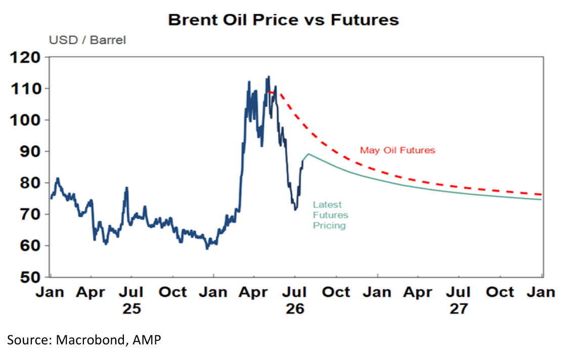
Chart 7: Company profits – positive
Consensus 12-month earnings expectations remain strong. This is helping support stretched equity valuations so any slippage could be a concern.
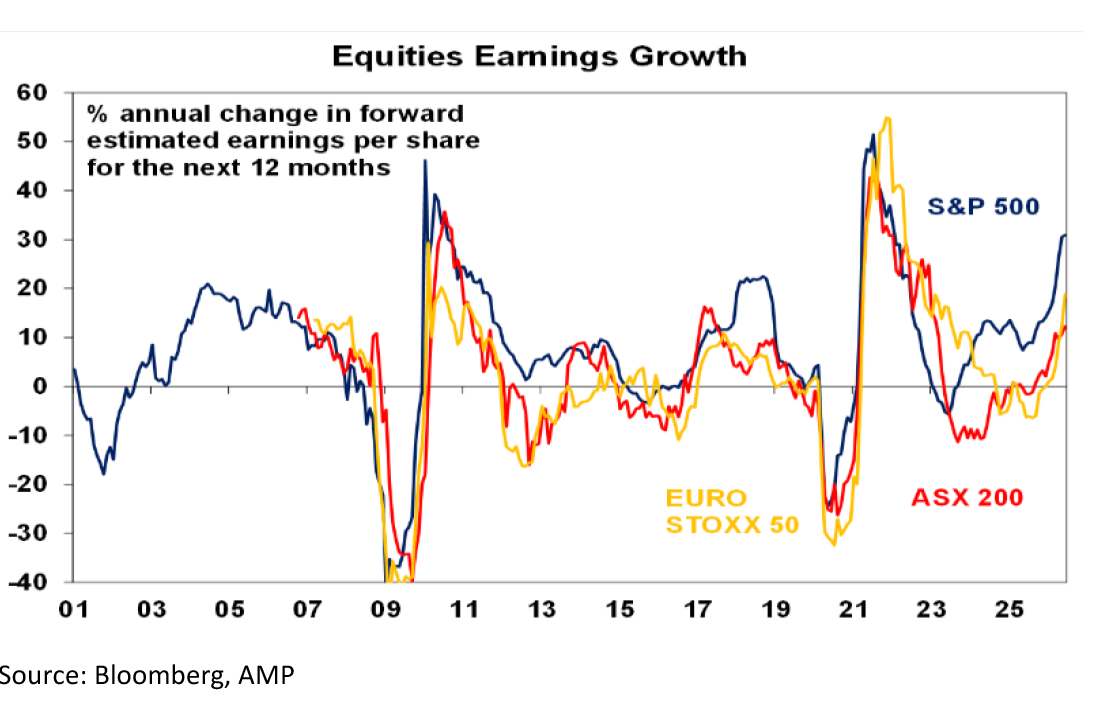
Chart 8 – Korean shares & the AI boom – cautious
Because of its exposure to computer chip production (via Samsung and SK Hynix), the Korean share market has sometimes been referred as Dr Kospi in that trends in it can be a positive or negative sign for the IT sector. Until recently it was being boosted by surging chip demand from the AI boom but recently faltered with a 28% fall. This could just be a correction and profit taking after doubling year to date and its forward PE ratio is just 6-7 times, but an ongoing slide could be a warning sign for the US AI boom. Particularly, with the risk that another Chinese AI company – Moonshot with its Kimi K3 AI model – may be a competitive threat to US AI labs.
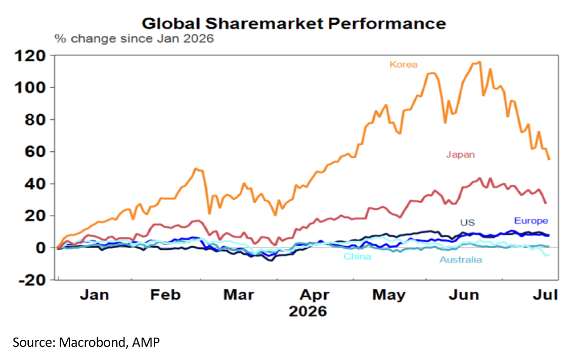
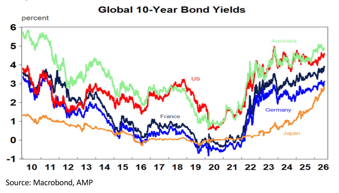
Chart 9: Bond yields & share valuations – negative
For the last 18 months or so US and Australian share valuations have been stretched offering little prospective risk premium over bonds. So apart from keeping on eye on earnings growth which needs to remain strong, bond yields are also worth watching because a continuation of the recent rising trend would be bad news for share market valuations.
By Dr Shane Oliver, Head of Investment Strategy and Chief Economist, AMP


